
A colourful world – using colours creatively

use colours to enhance your subject, and tell a story
What is colour? Objects absorb and reflect different wavelength of light, and how each object absorbs and reflects the different wavelengths is how they form colour. A red rose, well in this case its petals absorb all wavelengths of light except red. Some objects will reflect more than one colour in such cases when an object reflects yellow and red then it becomes orange.
In photography the colours we choose or capture impacts the overall emotion, mood or roles in an image. Knowing how to use or capture the colours around us is an important technique one can use and creative photography. Using a a single tone or many, combinations of different colours or the right composition or placement of colours will most definitely improve the way you tell a story or ‘the story’ in your images.
Let’s start with some general colours:
Red – in photography this colour is the most powerful or dominating colour. It represents passion, love, danger and yes stop. Stop because this colour grabs immediate attention. Personally I treat this colour with great respect, if you’re not careful it can be a distraction.
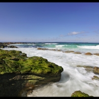
Green – the colour of nature, colour of health and life. Green is very soothing and calming but can easily be dominated by other colours. That is why in a landscape photo you tend to easily overlook this colour and search for other much vibrant colours such as colourful flowers.
Yellow – colour of nature and autumn. Yellow is also a strong colour such as the colour of the sun and of course all drivers will know that yellow means ‘caution’, feel free to use it but with a bit of restraint.
Blue – is a colour that can portray both positive and negative emotions. Coldness, sadness and loneliness are well portrayed in blue but can also represent serenity, peace, sereneness and tranquility.

loneliness, coldness is portrayed by the colour blue
Another important part of using colours as a technique in creative photography is understanding how to combine colours. It is crucial to know which colours clash and work well together. Clashing colours can either provide drama or just create confusion while using the right harmony of colours enhances an overall theme and a sense of completeness. Have a look at a colour wheel, the primary colours sit equidistant to each other, and flows from the closest shade to the next. Contrasting or complimentary colours would then be the opposite colour where it sits on the colour wheel.

It is also important to know how different colours behave in a 2D environment. Warm colours such as red and yellow would seem to pop-out or advance while cooler colours like blue and green tend to recede.
The next technique you can apply is knowing and experimenting when to mute colours or when to make them bolder or harsh. It will all depend on the story you would want to portray.
Remember, use colours to enhance your subject, as part your composition and to tell a much better story. No! Selective colouring when finishing your images is not a technique, to be honest Im not really fond of seeing them.
“ Beauty can be seen in all things, seeing and composing the beauty is what separates the snapshot from the photograph.” – Matt Hardy


What do you think? Leave a Reply